Black Bay Studio Branding
+ Branding + Art Direction + Logo Design + Merchandise + Print Design
Client: Black Bay Studio
Project Delivered: August 2023
If you head out west on the Isle of Lewis and go right to the edge, you will face the full power and drama of the Atlantic Ocean. Quite a stunning and inspiring place to be and an absolutely amazing setting for a recording studio.
Black Bay Studio is nestled on a pier in Kirkibost on the small island of Bernera, which itself is enveloped into the most western stretch of Lewis. The studio serves as a retreat space for musicians to come and craft their music and gain inspiration in the wild edges of the Island.
Founder Peter Fletcher opened the studio doors in 2016 having converted the building from a crab factory into a full functioning recording space which incorporates three spacious and beautifully designed acoustic rooms, comprehensive equipment list and comfortable accommodation for 9 people. With such a dynamic space, it was extremely exciting when Pete hired us to help brand the studio.
Our first conversation was about producing a crest-like logo that would look great on merchandise. He cited our previous projects like Williams Brothers Stone Craft and Rothair as the templates for this new crest. The angle of the studio's history as a crab factory was hard to ignore, and that fed into our imagery very early on.
“The angle of the studio’s history as a crab factory was hard to ignore, and that fed into our imagery very early on.”
“It has a distinctive machine head that was replicated for the crest, which also gave it a personal music touch.”
Pete is an accomplished guitarist himself with a fondness for Ibanez guitars. It has a distinctive machine head that was replicated for the crest, which also gave it a personal musical touch.
In early proofs, we felt we needed to represent the studio somehow. Its location on 'the edge of the World' was its unique selling point, so Pete was keen to get a sense of that, front and centre. The Arctic Tern (seen frequently in the area) tops off the scene symbolically flying high and free.
We developed the large crest graphic as the first approved part of the brand. Then extracting the main logo focussing on the studio location. We further distilled that down into the 'logotype' version for use in limited spaces.
We then took a look at developing further brand material beyond the logo. Pete needed a mini brochure developed to promote a commercial recording course the studio offered. This gave us a good subject to play around with how the typography, colours and photography broke down.
We spent an afternoon photographing elements around the studio. Specifically capturing close-ups of equipment and the space with a view to creating cerebral background suite of imagery that summed up the studio vibe. We applied a duotone halftone effect to these ‘vibe’ images. Making them analogue, like much of the equipment in the studio.
▼
“We wanted to supplement that with more creative photography that built up in a ‘zine’ like style. Creating a punk aesthetic while keeping a very professional feel.”
Pete already had some excellent photography of the space that serve as a great advertisement. We wanted to supplement that with more creative photography that built up in a 'zine' like style. Creating a punk aesthetic while keeping a very professional feel.
▼
The halftone images worked well but we felt another layer was needed. We wanted more elements on there to connect up the graphics and further that deconstructed aesthetic.
We broke down the original crest design into various elements: Waves, Tern, Guitar Strings, Crab claws and scattered in controlled chaos around the print design. The guitar strings served as connectors to the various boxes and call back to the original logo.
“We broke down the original crest design into various elements: Waves, Tern, Guitar Strings, Crab claws and scattered in controlled chaos around the print design. ”
We also added a layer of socket connections as a pattern. Hinting more at the technical side and the multitude of cables and wires in the studio.
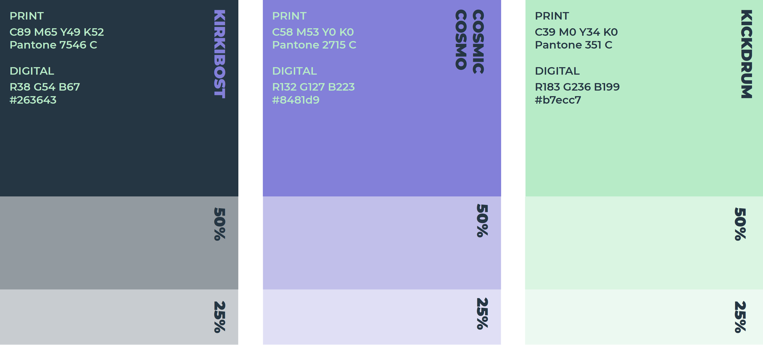
The main dark colour is an off-black marine colour 'Kirkibost'. Reflective of the harbour water at night. The darkness is offsite with two punchy electric colours of 'Cosmic Cosmo' and 'Kickdrum' to give a vibrant sense of the sounds produced in the space.
▼
With all these elements in place, we had some fun creating some print design, t-shirts, merchandise, web and social assets and a style guide for Pete and the team. The new brand will roll to over the coming months on the Black Bay channels and help to elevate the profile of the studio in the music industry. Pete was very pleased too.
▼
“What we love about working with Pearse is that he doesn’t just provide excellent, creative graphics (which he really does), but he has expertise in marketing and promotion that is so helpful to the business. He’s not simply providing the assets we’ve asked for but additional guidance on where branding can be implemented to improve what we do, often in ways we’d not even considered.”


